Making Diagrams from Text
As we create software, it is very useful to be able to create diagrams about the software that we want to create, or have created. However this can be time consuming to do, and very time consuming to maintain as the plans/designs change. The solution is to generate diagrams from simpler text descriptions.
To try and get around these downsides, I want to show a few ways we can get our diagrams generated for us from a simple text based language. Creating diagrams from text gives a few benefits:
- It’s simple to create diagrams this way. Rather that creating a large XML document, the approaches I’ll show will have simple languages for describing diagrams.
- It’s simple to store. We can create the diagrams if we want to, but our primary storage can be the text that generates them. This can be commited to our version contol system too.
- It’s easier to maintain. Putting the text in source control means we can track the real changes to the diagram over time, and merge changes to diagrams between branches.
So what our the options?
Web Sequence Diagrams (websequencediagrams.com)
Now, as the URL suggests, web sequence diagrams only does one type of diagram - sequence diagrams.
Now that might sound like a big limitation, but sequence diagrams are actually pretty useful for describing the behavior of a system.
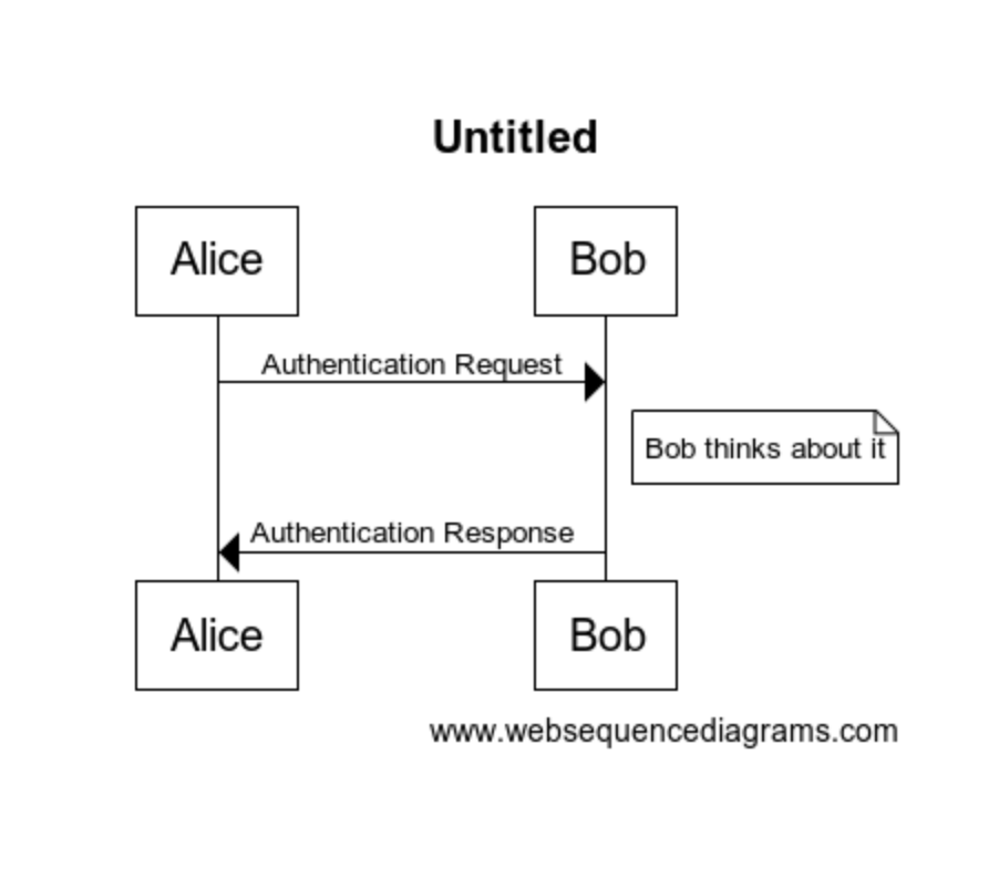
Entering some simple test like this:
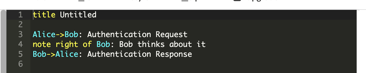
gets you a diagram like this:
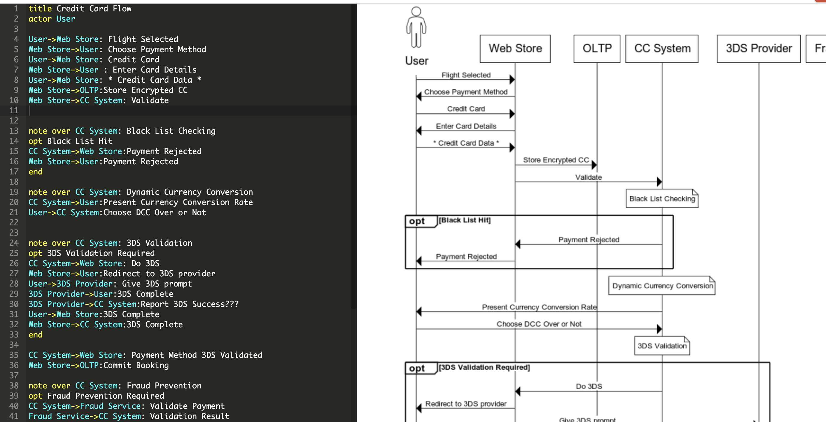
That’s pretty cool, and we can end up creating some pretty big diagrams:
The last thing worth point about about websequencediagrams.com is it can produce diagrams with different styles. Some of these styles are part of the paid version of the site, but its good to have options.
The paid version ($15/month at time of writing) has features like saving your work, larger diagrams, more styles, and ‘includes’ of other sub-diagrams.
Mermaid.js (https://mermaid-js.github.io/mermaid/)
Mermaid.js is good because it’s Javascript based. This means that, using nodejs, you can run it as a local image generator on your machine, without a website required.
You can also use it on your website in a browser too. In fact, there is a live editor for mermaid JS diagrams at https://mermaid-js.github.io/mermaid-live-editor/#/edit/.
Mermaid supports a bunch of different diagram types:
- Sequence Diagrams
- Gantt Chart
- Flow Chart
- Class Diagrams
- State Diagram
- Pie Chart
- ER Diagram
- User Journey Diagrams
It also supports theming these diagrams.
One of the things I personally love about mermaid.js is that it’s diagrams (currently only 2 types) are supported in Azure DevOps. The official documentation for Mermaid in AzDo is here.
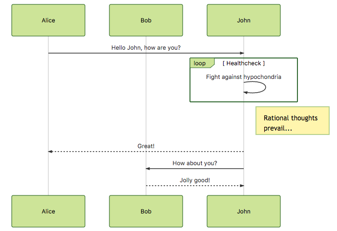
You can add something like this to your wiki:
::: mermaid

sequenceDiagram
    participant Alice
    participant Bob
    Alice->>John: Hello John, how are you?
    loop Healthcheck
        John->>John: Fight against hypochondria
    end
    Note right of John: Rational thoughts <br/>prevail!
    John-->>Alice: Great!
    John->>Bob: How about you?
    Bob-->>John: Jolly good!

:::
And it will render in the page as:
At Avanade we are using a ‘Documentation as Code’ approach centered around the Azure Devops wikis. We are keeping our markdown based documentation in a folder structure next to our source code, and every commit that adds or changes the functionality needs to include documentation changes. We then publish these folders as a wiki. Having the ability to have diagrams included in that documentation be generated from the text is super powerful.
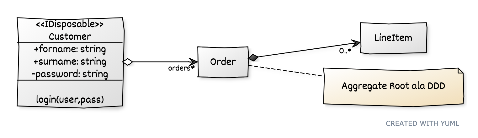
yUML (https://yuml.me/)
yUML is another website for creating diagrams. It supports
- Class Diagrams
- Use Case Diagrams
- Activity Diagrams
They have a cool Scruffy style which I like, imitating hand drawn
Diagrams as Code (https://diagrams.mingrammer.com/)
This is a cool library that does something a little different from the other. Rather than try to create a form of UML diagrams, it creates cloud architecture diagrams.
One of things I hate about creating architecture diagrams that show the cloud services that are being used is finding the right icons for the all the services.
This library helps fix that challenge.
It’s a python library that generates diagrams locally by running a python script.
An Example script:
from diagrams import Cluster, Diagram, Edge
from diagrams.onprem.analytics import Spark
from diagrams.onprem.compute import Server
from diagrams.onprem.database import PostgreSQL
from diagrams.onprem.inmemory import Redis
from diagrams.onprem.logging import Fluentd
from diagrams.onprem.monitoring import Grafana, Prometheus
from diagrams.onprem.network import Nginx
from diagrams.onprem.queue import Kafka

with Diagram(name="Advanced Web Service with On-Premise (colored)", show=False):
    ingress = Nginx("ingress")

    metrics = Prometheus("metric")
    metrics << Edge(color="firebrick", style="dashed") << Grafana("monitoring")

    with Cluster("Service Cluster"):
        grpcsvc = [
            Server("grpc1"),
            Server("grpc2"),
            Server("grpc3")]

    with Cluster("Sessions HA"):
        master = Redis("session")
        master - Edge(color="brown", style="dashed") - Redis("replica") << Edge(label="collect") << metrics
        grpcsvc >> Edge(color="brown") >> master

    with Cluster("Database HA"):
        master = PostgreSQL("users")
        master - Edge(color="brown", style="dotted") - PostgreSQL("slave") << Edge(label="collect") << metrics
        grpcsvc >> Edge(color="black") >> master

    aggregator = Fluentd("logging")
    aggregator >> Edge(label="parse") >> Kafka("stream") >> Edge(color="black", style="bold") >> Spark("analytics")

    ingress >> Edge(color="darkgreen") << grpcsvc >> Edge(color="darkorange") >> aggregator
generates:
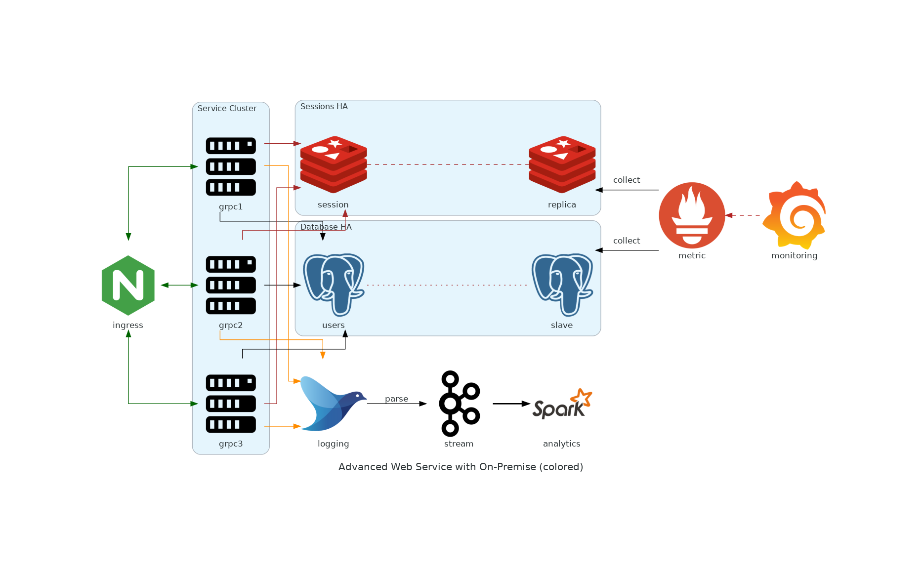
There are a bunch of different technologies and cloud provider logos setup in there already. I think this makes it pretty simple to create these diagrams.
Summary
Documentation as code (docs in source control with code) is the only approach I’ve seen or experienced where the projects/products keep their documentation up to date. I personally love this that there are options to make our diagrams part of that same process.
If you find other approaches for doing this, please drop me a comment on this post or tweet it to me on twitter.
Comments